
I am not trying to take Microsoft out of business, but after I read on the Power BI team’s blog that the anomaly detection feature was coming, I decided to see if I could implement something like this myself using DAX. Turns out we can build something very useful without having to run regressions and Machine Learning Models.
In my approach I calculate the change in rankings for every product in every period and then take an absolute value of that change and then I sum all of those variances up. That gives me a pretty good proxy into how much the distribution of product sales have changed month over month.
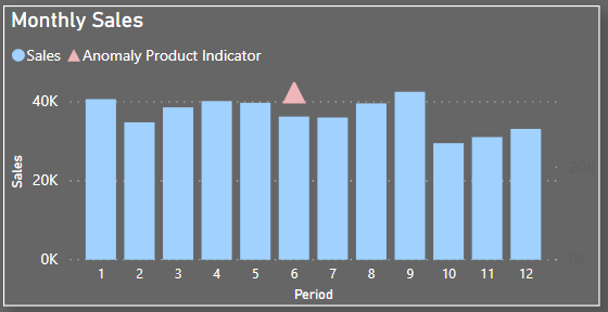
Then I put an indicator right above a period that has the most interesting stuff going on, making it easier for the end user to decide what bar on the trend chart is worth interacting with.
You can download the model used in this tutorial here.
As usual, all the details are in the video below:
Sales = SUM('Sales'[Sales Amount])
Sales Prior Month = CALCULATE([Sales], PREVIOUSMONTH('Date'[Date]))
Rank Product =
RANKX(
    ALL('Product'),
    [Sales]+0,
    [Sales]+0
)
Rank Product Prior Month =
RANKX(
    ALL('Product'),
    [Sales Prior Month]+0,
    [Sales Prior Month]+0
)
Anomaly Product =
IF(SELECTEDVALUE('Date'[Period])<>1,
    SUMX(
        'Product'
        ,ABS([Rank Product] - [Rank Product Prior Month])
    )
)
Anomaly Product Indicator =
IF(
    [Anomaly Product]=
    MAXX(
        ALL('Date'[Period]),
        [Anomaly Product]
    ),
    [Sales]
)
