
If you have tried to use the default Power BI waterfall chart to recreate your PowerPoint variance bridge but got frustrated because you were not able to show from and to values along with your variances, then you are in luck, because in this video I will show you how you can build any variance bridge in power bi and make it look the way you would expect it to.
Most waterfall charts that you see in Power BI look like this:

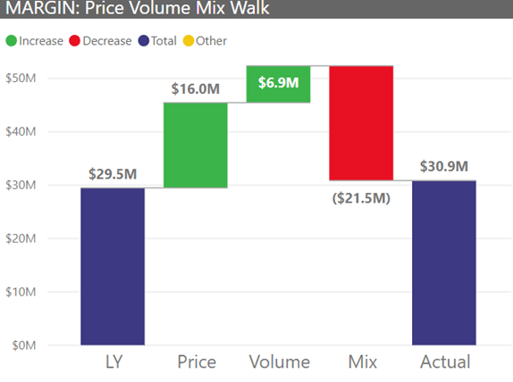
In other words, you can see the total variance (1.4M) in the chart above, and also the breakdown of that variances along the selected category., However, you are not able to see the starting and ending values like you can in the chart below:
In my video I go over the steps to make the standard Power BI Waterfall chart do what you would expect it to do out of the box. Please see the DAX below for additional details:
Original Margin PVM
PVM (Margin) =
SWITCH (
SELECTEDVALUE ( PVM[PVM] ),
“Price”, [PVM Margin – Price Impact],
“Volume”, [PVM Margin – Volume Impact],
“Mix”, [PVM Margin – Mix Impact],
BLANK ()
)
Adjusted Margin PVM
PVM (Margin) Bridge =
SWITCH (
SELECTEDVALUE ( Walk[WalkSort] ),
1, SWITCH (
SELECTEDVALUE ( PVM[PVM] ),
“Price”, -1 * [PVM Margin – Price Impact],
“Volume”, -1 * [PVM Margin – Volume Impact],
“Mix”, -1 * [PVM Margin – Mix Impact],
[Margin LY]
),
2, SWITCH (
SELECTEDVALUE ( PVM[PVM] ),
“Price”, 0,
“Volume”, 0,
“Mix”, 0,
[Margin]
)
)
Walk table:
|
WalkStart |
WalkSort |
| LY | 1 |
| Actual | 2 |
Category (or PVM) table:
|
PVM |
Order |
| Price | 1 |
| Volume | 2 |
| Mix | 3 |
| New Products | 4 |
| Discontinued Products | 5 |

You need to post sample PBI file which would help us understand better.
I will post it with the next review of the other waterfall chart custom visuals that I said I would do. Hopefully, next week…
Hi,
Did you ever post the sample file? I’ve tried to find the post you mentioned.
Hi, where can I find the sample power BI file please?
Do the 2 tables Walkstart andPVM have to be linked to the table where you have the values through relations?
They should not be linked
HI SIR
Is there any chance to sort breakedown?
I have 5 packets in the middle (Price, Volume, ..ect),
I check the packet formula in matrix table and they are correct,
I followed the same steps and dax formula but what happened, the beginning total column takes the (price) pocket value, not the beginning value I defined in [switch 1], then the first packet takes the price, and then 0 for last total column, the 4 pockets not showing and the last column shows 0 not the end balance I defined in [switch 2]??
I don’t know why, can you please help?
If I were to add another time dimension, e.g. year, would the approach work?
Yup, it sure would
Hello, and thank you for sharing this very interesting find. How to order with the CategoryOrder variable? My bridge is ordered according to the % evolution of each category and not according to the order of the defined categories.
Can this be applied to move three periods? E.g. i/o LY and Actual, can we show 2020, 2021 and 2022?
Not dynamically, unfortunately… you may want to check out the ultimate waterfall chart, as it is free and has a few more options. I also have a review of that chart here and on YouTube
Can you order the breakdown e.g. in the sequence of Mix, price, volume i/o ordering by their value?
I did it according to your example, but my chart is not sorting by category order. he is ordering by value. what can be wrong?
You are either not sorting by it in the chart or you have not ordered the column by sort order
Exactly what I was looking for! After spending a significant amount of time trying to get this to work – this approach was spot on! Thank you!
Thanks for the excellent tutorial! The legend now shows a new entry ‘Other’, would you know how to get rid of it?
I have gone through your vide and implemented waterfall chart but my current column (last of chart) is not getting displayed completely and its been shown as relative only. could you please help.
Thank you for the tutorial, I managed to implement it. However I have one small issue that my breakdown categories (Volume and price) don’t always show up in the same order. My charts places the bigger value at the beginning and I would like to force the volume to always show at the 1st breakdown place
Make sure you have a custom sort order done of the buckets by the sort attribute, then order by it in the chart
The sorting isn’t working in the video either, the order is always dependent on each category’s size
Has anybody resolved this? Searched entire internet for a solution but nothing yet!!
You need to use a “disconnected” table to correct your sort order. Use “Enter Data” to create a column with the “label,” aka the text value you want to appear in the visual, and then another column with the sort order value (number). You can use any number set that increases in value. I usually start with 0 and then up from there…0, 1, 2, 3, and so on. The key is to add it to the visual axis but with no relationship to the data so that the data doesn’t impact your sort order.
Back again – the waterfall works well with values but seems to have trouble breaking down percentages. For example: if I own a percentage of houses in a market that includes multiple states and I want to see which state has contributed +/- to my overall percentage from a previous period to current period – the % returned by the breakdown is bound to the change for each state, not the % change against the total. For Example: Prior period I have 50% and now I have 55% of the total market – The visual instead of breaking down the 5% +/- contribution per state the visual is returning the % change within each state which often exceeds the 5% total change. Any ideas on what I might be missing or is this even possible?
Is there a way to have the packets as a hierarchy? I tried adding something like “Country > State > City” in the breakdown but Power BI does not allows it. I tried changing Category for Breakdown, but the result looks different. If you know anything let me know, please!
Thanks for your posts about waterfalls, they have been really helpful.
As stated above, exactly what I needed, thank you. However, as I do not understand exactly how this works, I cannot fix the issue that came up. The Original code gets it right but the Adjusted one gives the following:
1. Start and End positions are correct
2. All effects in the middle are the same (equal to total difference between Start and End)
The code seems exactly the same as the one you are showing but apparently not. Anyone can help?
Thank you!
Waterfall Bridge =
Var VolumeEffect = SUM(‘ALL Effects'[Gross Sales Volume])
Var MixEffect = SUM(‘ALL Effects'[Gross Sales Mix])
Var PriceEffect = SUM(‘ALL Effects'[Gross Sales Price])
Var FXEffect = SUM(‘ALL Effects'[Gross Sales FX])
RETURN
SWITCH(SELECTEDVALUE(‘Start-End'[WalkOrder]),
1,
SWITCH(SELECTEDVALUE(Index[Effect]),
“Price”, VolumeEffect,
“Mix”, MixEffect,
“Price”, PriceEffect,
“FX”, FXEffect,
SUM(BASE[GSR])
),
2,
SWITCH(SELECTEDVALUE(Index[Effect]),
“Price”, 0,
“Mix”, 0,
“Price”, 0,
“FX”, 0,
SUM(NEW[GSR])
))
This is hands-down one of the best and most useful PBI posts I have ever come across. I would never have arrived upon this solution on my own, and you explained it in very clear, easy steps. The sample code was a life-saver. Excellent work, and thank you!
Thank you sir! Glad it was helpful…
Hello, thanks for very useful trick for waterfall chart. Just one issue, despite I am using sort by column command in my table for breakdowns I could not sort it in an order that I have in my table. I tried to use chart option of sorting but it sorts with based on values.
I will be doing a follow up on this soon… Stay tuned…
Hello, is there any update about sorting by breakdown? I really need to sort by months by the breakdown is still sorting by values.
Is there a video on sorting by breakdown? I can’t get this part right.
Hi there! Did you find a way do sort by breakdown? For the life of me I can´t figure out how to do it.
Thanks a lot for this! I have created the “switch” measure and that works if I hard code numbers in it or use columns from my tables. If I use measures, it will not display any value, but does not produce an error. If I define variables, it is exactly the same. What am i missing here? I thought I would be able to switch in any value. I want to switch in measures that are calculated based on slicer values, could that be a problem?
Hello:
I have a 2 part question:
In your waterfall example you have 3 categories between start and end columns.
If I need to show up to 10 categories depending on the amount of contribution, I am wondering if I can add a slicer to let me pick which categories to include/exclude?
For those that I exclude, I want to sum them up under other category, and show the other category as the second last column in the waterfall chart. Is that possible?
Genius! THANK YOU! It is great, that people like you share their knowledge for free! This helped me a lot with my Power BI Project! Again a BIG THANK YOU!
Thank you for explanation how, it was realy helpfull.
What mu users would like to see is consistent sorting of breakdown elements. As I figured, this is something it is not possible in current visual version.
For everyone who need it, please support the idea here:
https://ideas.powerbi.com/ideas/idea/?ideaid=7b5d9393-7b1f-4ce9-85e4-0b06a949ae11&page=2
Exactly, this is the only thing that prevent me from switching from xViz (licensed visual) to standard one.
Hello, where can I download your video’s PowerBI file? Thank you!
hi
have some problem
i did what you explained
“GMVA_VAR =
VAR SELECTEDCATEGORY = SELECTEDVALUE(Walk_Start[walk_start])
VAR SELECTEDBREAKDOWN = SELECTEDVALUE(GMVA_CATEGORY[GMVA_Category])
RETURN
SWITCH(SELECTEDCATEGORY,”LY GM”,SWITCH(SELECTEDBREAKDOWN,
“Price”,-1*GMVA[Price_Var_Impact%],
“Vol/Mix”,-1*GMVA[Vol_Mix_Var_Impact%],
“MC”,-1*GMVA[Material_Var_Impact%],
“Production”,-1*GMVA[Prod_Var_Impact%],
“Logistics”,-1*GMVA[Log_Var_Impact%],
“Other SC”,-1*GMVA[OSCC_Var_Impact%],
GMVA[GM_GMVA_PY]),
“CY GM”,SWITCH(SELECTEDBREAKDOWN,
“Price”,0,
“Vol/Mix”,0,
“MC”,0,
“Production”,0,
“Logistics”,0,
“Other SC”,0,
GMVA[GM_GMVA_CY]))”
but in the pbi waterfall visualization I have limit of only 2 breakdowns, so I cant present all my breakdown buckets
what I have to do ?
Hi biZ-i,
Great post and blog. Very structured and well explained – it was help full. Could you advice if the following is possible with power bi?
I want to create a dynamic waterfall chart filtered via a period slicer.
The waterfall chart needs to display 2 periods – selected period and the previous one.
The values contribution to the water fall movement are already calculated….. basically, I have the values in the same structure as in excel.
So cool, perfect basis what I needed to get done! Thanks a lot.
It took me a while to make both SWITCH layers to work, but eventually it worked. I used the waterfall chart to report variance in cost instead of revenue, therefore only had to invert the colors.
The only additional step that is required, but not mentioned in this post is that you need to add the ID (order) field of the Breakdown table (in this case PVM) in the Tooltip section in order to have the option of sorting the data by this option.
For me adding ID column to tooltip doesn’t work – it wont add.
How did you achieve it?
PexVariance Bridge =
Var WandSImpact = CALCULATE( SUM(‘Final Data Category 2024′[EUR]) , ‘Final Data Category 2024′[Category] = “Wages & Salaries”, ‘Final Data Category 2024′[PostingPeriod] < Month(TODAY() )) – CALCULATE( SUM(‘Final Data Category23′[EUR]) , ‘Final Data Category23′[Category] = “Wages & Salaries”, FILTER(‘Final Data Category23’, ‘Final Data Category23′[PostingPeriod] < Month(TODAY())))
Var BonusesImpact = CALCULATE( SUM(‘Final Data Category 2024′[EUR]) , ‘Final Data Category 2024′[Category] = “Bonuses”, ‘Final Data Category 2024′[PostingPeriod] < Month(TODAY() )) – CALCULATE( SUM(‘Final Data Category23′[EUR]) , ‘Final Data Category23′[Category] = “Bonuses”, FILTER(‘Final Data Category23’, ‘Final Data Category23′[PostingPeriod] < Month(TODAY())))
Var PexLY = CALCULATE( SUM(‘Final Data Category23′[EUR]) , ‘Final Data Category23′[Expenses Type] = “PEX” , FILTER(‘Final Data Category23’, ‘Final Data Category23′[PostingPeriod] < Month(TODAY())))
Var PexYTD = CALCULATE( SUM(‘Final Data Category 2024′[EUR]) , ‘Final Data Category 2024′[Expenses Type] = “PEX”, FILTER(‘Final Data Category 2024’, ‘Final Data Category 2024′[PostingPeriod] < Month(TODAY() )))
Return
SWITCH( SELECTEDVALUE(Walk[WalkSort]),
1,
SWITCH(SELECTEDVALUE(PexOrder[PEX]),
“Wages & Salries”, -1*WandSImpact,
“Bonuses”, -1*BonusesImpact,
PexLY
),
2,
SWITCH(SELECTEDVALUE(PexOrder[PEX]),
“Wages & Salries”, 0,
“Bonuses”, 0,
PexYTD)
)
I keep getting the waterfall chart inverted, any tips for that? I copied and pasted the exact concept of the Bridge Measure
Thank you so much for this tutorial. It’s fantastic!
I used this to build a waterfall dashboard that is wonderful, however I do have one scenario that I cannot seem to get around:
If I have an undefined and dynamic number of “breakdown” items (let’s say product categories that can and will change in the future), how can I apply the “SWITCH” function in that case?
I don’t want to have to hard code the categories to avoid rework in the future.
Thanks!