
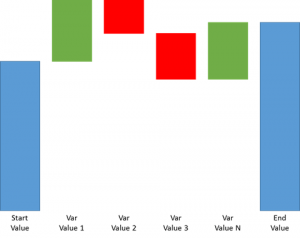
As you may have already noticed, Microsoft introduced a couple of new visualizations in powerbi.com yesterday. One new type that I am particularly excited about is a waterfall chart. Normally, when I think of a waterfall chart I am thinking of something like the chart above.
You can see blue bars representing begging and end values and then red and green bars represent gains/losses (increases/decreases) and the sum of red and green values should bridge the difference between start and end values.
Microsoft’s implementation of a waterfall chart looks a little different.

As you can see from the chart above, Power BI’s waterfall chart does not have Start and End values. Instead, the chart plots increases and decreases in values (in this cases for year over year market share) in green and red respectively and then the total gain or loss in blue.
It took me a while to get used this format, as I kept trying to bridge the first and last bars on the chart with the values in the middle, but after a while, I got used to it and now I actually think prefer it that way. One hand it is very useful to see increases/decreases relative to begin and end values. On the other hand, these changes are often much smaller than the totals so dealing with difference in scale becomes a major headache sometimes.

Hi, did you manage to do this first chart with Start and End values in the PowerBI? I’m having a task to build it that way and I’m not sure where to start?
Hello, have a look at the Power BI Ultimate Waterfall Chart..
http://dataviz.boutique/2017/03/22/powerbi-ultimate-waterfall-custom-visual/
A new waterfall chart in Power BI! Finally, the “real” waterfall chart shows up.