
This might be the first (and possibly only) time in a very long while that I got really excited about a custom visual for Power BI. Yes, I use custom visuals every now and then, but generally speaking I would have to admit that I am not a fan. Most of them do a good enough job but the free ones are usually underwhelming while the paid ones are often just adequate to warrant the hassle of dealing with procurement headaches.
Inforiver, (https://inforiver.com/) however, is in a league of its own. It’s not really fare to compare it to most of the other custom visuals in Power BI. You would not be comparing a bicycle to a Tesla, would you? Both can take you from point A to point B, but only one of them is a marvel of modern engineering. Therefore, I did not want to frame this article as a review, but rather as an introduction to Inforiver, and the reason I use the word “introduction” is because this visual (or should I call it a product?) is so feature rich that it would take me too many pages to go into every feature in any detail.
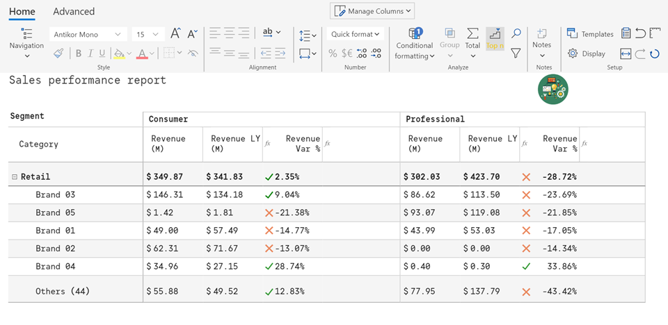
Now, you might be asking yourself – Andre, why are you so excited about a control that on a surface appears to simply replace the already available Table and Matrix visuals? Well, read on and find out…
So the main theme of this post is the word features. The product is so feature rich, in fact, that the development team had to implement its own ribbon because the standard properties pane for Power BI visual would simply not be able to support what this visual is able to do.
Some of my favorite features are the following:
- Ability to zoom in and zoom out during a presentation
- Ability to have a cell level formatting
- Pixel perfect formatting options for columns and rows
- Ability to easily insert now columns (static and using local measures/calculations)
- Ability to format headers and footers
- Ability to add logos/images in a header/footer that would appear on every page
- Ability to create local measures/variables that do not clutter your model. Ability to add report/visual specific variables
- Ability to easily create data driven page breaks
- Ability to do to Top N (dynamically group the tailing rows)
- Ability to add Notes
Any many others… unfortunately, it would take too long to describe all of these here, therefore, your best bet is to watch the video.
In short, this is a great product that I am very excited about. This is a professional version which makes me think that other versions will follow with even richer set of capabilities. Cannot wait to see what they will be!

I agree! I’ve downloaded and tested it out and it is feature packed, even at this level. The website states that there will also be a Premium and Enterprise level coming in December 2021. No pricing as of writing.
Yup… This product will only keep getting better… We’ll see what the pricing will be