
I found this interesting chart on Datawrapper.de and it made me think about how (and whether) my chart selections also changed over time.
(Datawrapper is a pretty cool tool that allows users to upload their data and create pretty stunning visualizations)
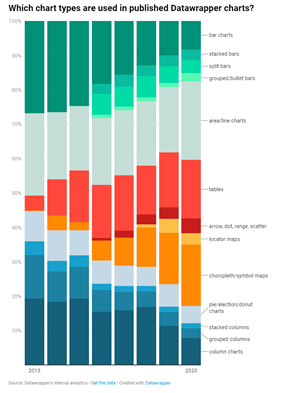
In this chart, Datawrapper has analyzed changes in distribution of chart styles selected by its users… The first thing you will notice is a dramatic drop in usage of column and bar charts that is offset by an increase in usage of tables and choropleths/symbol maps. Also, I found it interesting that scatter plots were barely used.
In this video I reflect on how and why my own chart selections have changed and also why I think you should use scatter plots more.

your blog is amazing!